Aurash Khawarzad
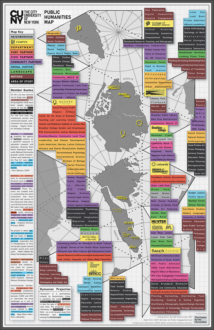
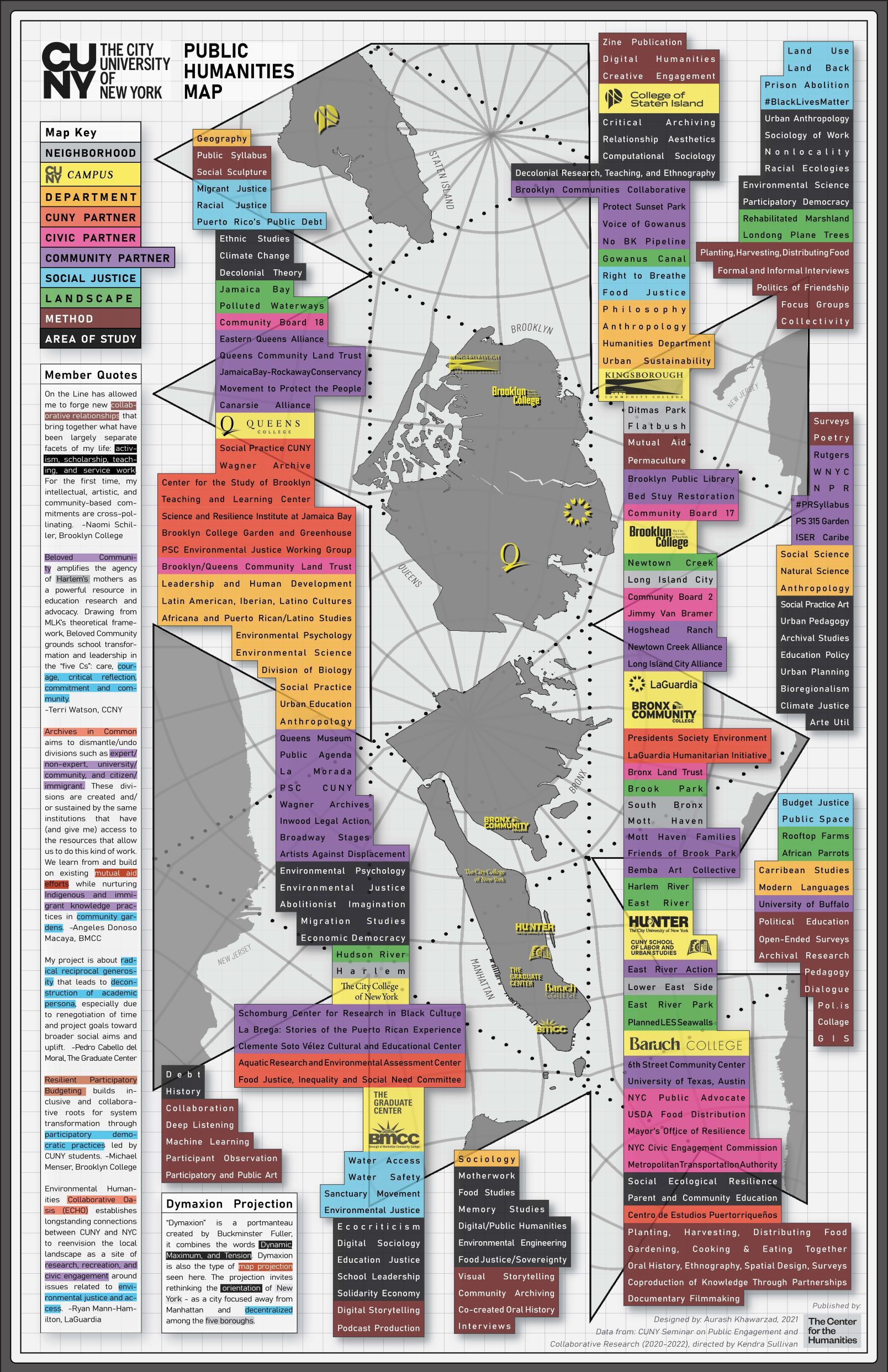
The Public Humanities Map, created for the Center for the Humanities, is an attempt to frame the geographic scope and social connectivity of research projects being carried out by faculty in the Andrew W. Mellon Seminar on Public Engagement and Collaborative Research. Humanities programs at CUNY have been at the forefront of developing participatory action research projects that use creative practice, quantitative documentation, and everything in between – this map is an early attempt to document those various initiatives and facilitate analysis of how they relate to each other.
As a whole, the map shows the wide range of people, neighborhoods, areas of research, and other factors that go into humanities studies. It reveals the centrality of doing “place-based” work, including building relationships with community members/organizations, in the process of better understanding complex political, environmental, economic, and related systems. The color-coded categories on the map, which reflect responses to a faculty survey, are loosely placed around the campuses and/or neighborhoods they have a connection with. The survey and map are an attempt to catalogue the full scope of research into the humanities across the five boroughs. It does not capture everything but gives insight into the range of research being carried out, where there are concentrations or absences of activity.
The rough configuration of information on the map is representative of the fact that issues and people cannot be neatly placed in one place or category, but rather span demographic groups and geographic territories across the city, region, and beyond. Looking closely, the viewer is invited to make their own connections between the color-coded “post-it notes” on the map, imagining new stakeholder combinations for research projects, new multi-disciplinary issues to investigate, and other novel avenues for better understanding the humanities.
As its underlying map of New York City, the Public Humanities Map takes inspiration from the Dymaxion map projection, created by Buckminster Fuller and Shoji Sadao in 1954. The map projection shows the surface of the Earth as a connected series of land masses within one ocean. It is recognized for having little distortion of continents, unlike the often used Mercator projection. As a map of New York the dymaxion projection represents the City as its own world, with connected boroughs but without one center. Decentralizing New York, as opposed to a Manhattancentric map, is an appropriate canvas for a city where communities on the fringes have disproportionate power in society but play a very important role in its culture, economy, and much much more.
(For more of Aurash’s work visit www.aakpress.com).